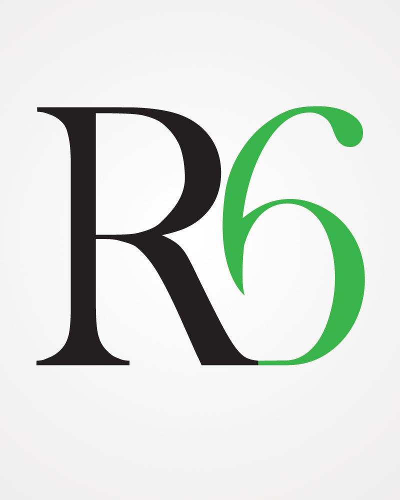
This was a fun project for me as I was asked to do this logo by the Region 6 volleyball program. I was also later asked to join the program for one summer as a coach, so it was doubly special.
Concept
The logo needed to be simple, to stand on its own without typography and to represent the colours of Region 6 – green and black.
Info
- Client: Region 6 Volleyball
- Services: Logo design
- Year: 2011
The R and 6 were united to show unison between the teammates and the region as well as exhibit a strong athletic ability. The 6 was left open to symbolize a leaf-like and nature quality that the region Deep River to Kingston and east to the Quebec border) boasts.