
The Euterra Landscapes logo design was an interesting one for me. I decided to give online design challenges ago and after only a few submissions to different projects, I came out with a win for this logo. It was an excellent experience that I would recommend to all designers, especially ones starting. You get to submit designs to as many projects as you want, you get experience and build a portfolio pretty quickly. It’s also fun to win a little cash if you can. For anyone wanting to try it out, set aside a certain amount of time to work on each project based on the prie money so that you get a sense of how you’d work in the real world.
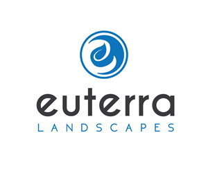
Original in blue
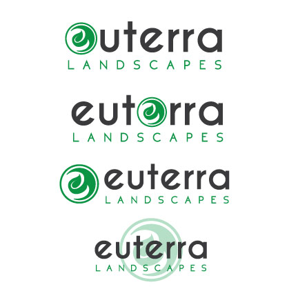
Colour and placement variations
Concept
The brief asked for “a logo design for our company “Euterra”. We are a landscaping business based in Atlanta. Our business consists of landscape design, installation, and maintenance. We would like the design to be simple. Please keep colours to a minimum of 1 or 2 possibly in blue and grey (open to other ideas).”
The first submission I did was in fact in blue and grey as the client asked for. In this case, you can’t speak to the client directly so you need to go with what is in the design brief. I wanted something simple but with an icon that could be used separately as well. The leafy “e” came to me as an idea that the “e” would be cut out from a vine that was properly trimmed.
Info
- Client: Euterra Landscapes
- Services: Logo, Branding
- Year: 2014
After selecting my logo as the winner of the contest, the owner contacted me and asked for some colour variations as well as placement variations. With a bit of back and forth, we decided on the original layout but went with a vibrant green that signified growth and healthy plants.
